Skip to content
Graphic Design Engineered for Human Performance
Where Nutritional Science Becomes Visual Intelligence
At AirVigor, design is not decoration—it’s a scientific communication system. Our visual framework transforms complex nutritional data into instantly readable structures for everyday consumers. Every detail—from ingredient composition to dosage guidance—is engineered for precision, clarity, and trust.
We call this approach Visual Science System™, a design ethos created for global compliance, intuitive understanding, and informed daily nutrition decisions.
Our Design Philosophy
Clarity, Precision, Regulatory Accuracy
A Graphic System Built on Research, Usability & Global Standards
AirVigor’s design philosophy merges nutrition science, information architecture, and visual engineering to create packaging that everyday consumers can understand instantly.
Our design principles include:
- Critical Information First
Ingredient composition, scientific dosage, usage guidance, and unique benefits appear in high-visibility zones. - Decision-Making Efficiency
Icons, structured hierarchy, and color logic reduce cognitive load so users instantly know how to use the product. - Global Consistency
No matter where consumers encounter AirVigor—US, EU, Japan, Korea—they understand the same visual language and clear information structure. - Cognitive Load Reduction
Design minimizes confusion, enabling correct supplementation and easier product selection across multiple categories.


AirVigor Visual Language System
A Cohesive Visual Identity Built for Trust & Performance
Color Psychology · Typography · Scientific Iconography
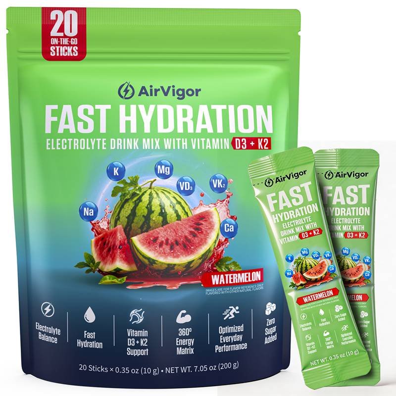
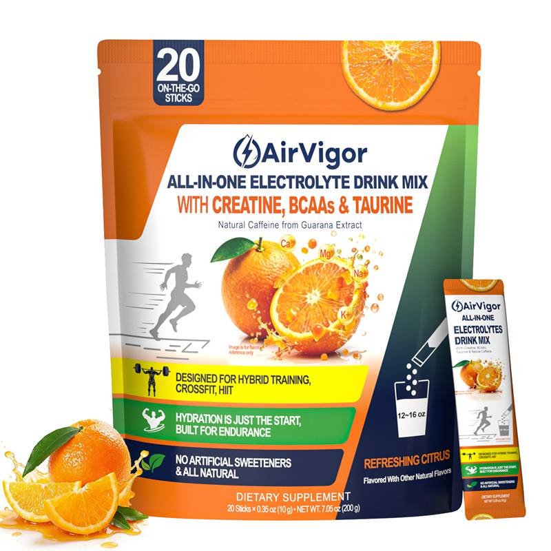
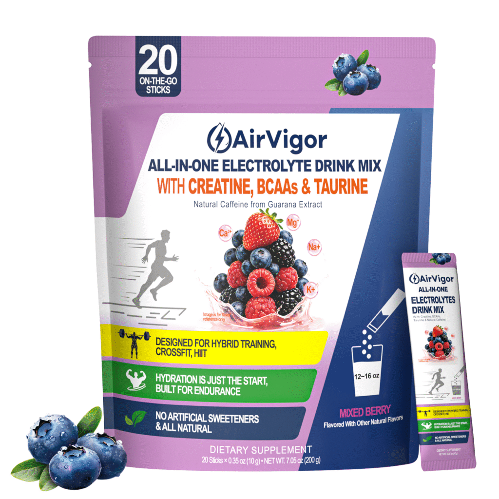
AirVigor’s visual language communicates purity, reliability, and scientific credibility.
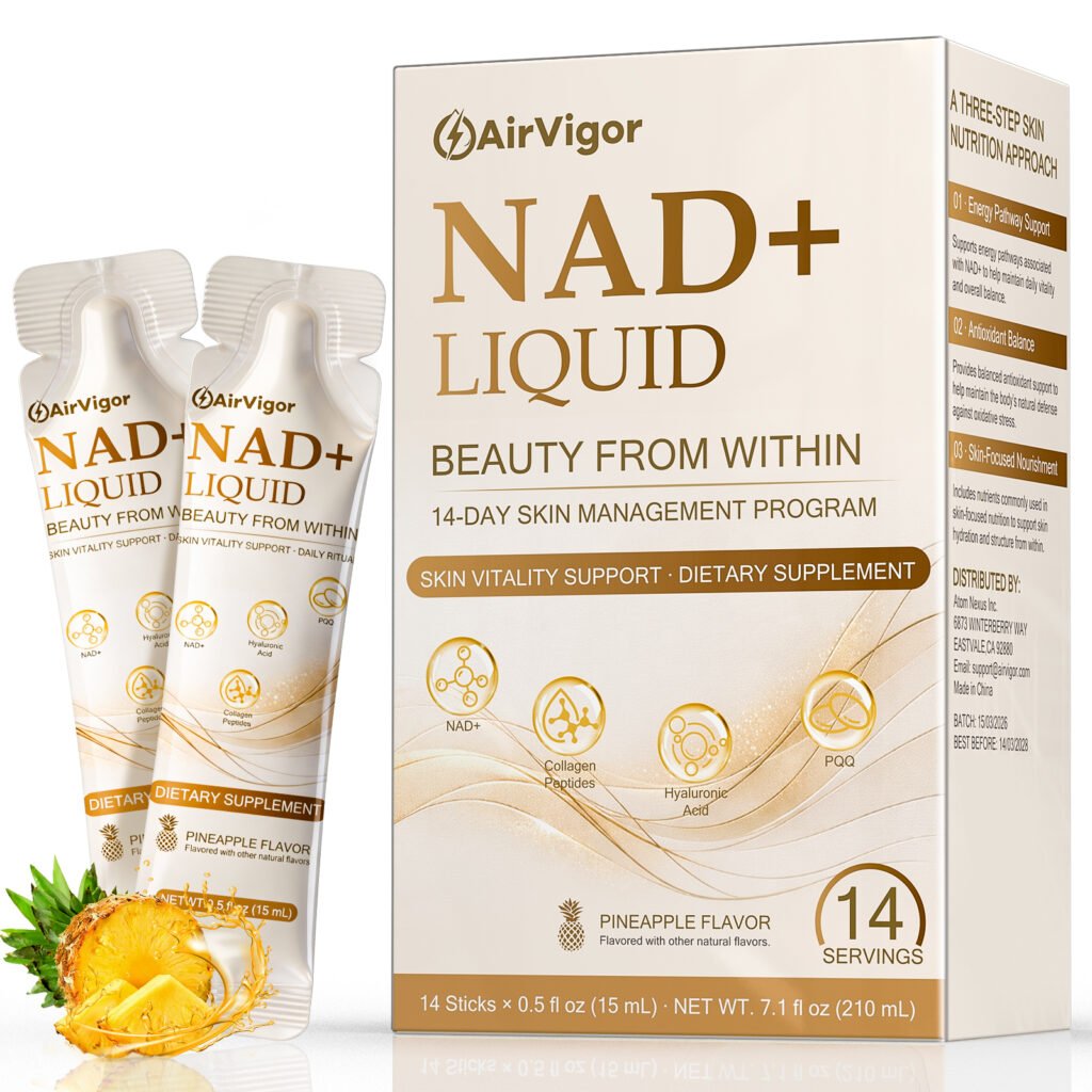
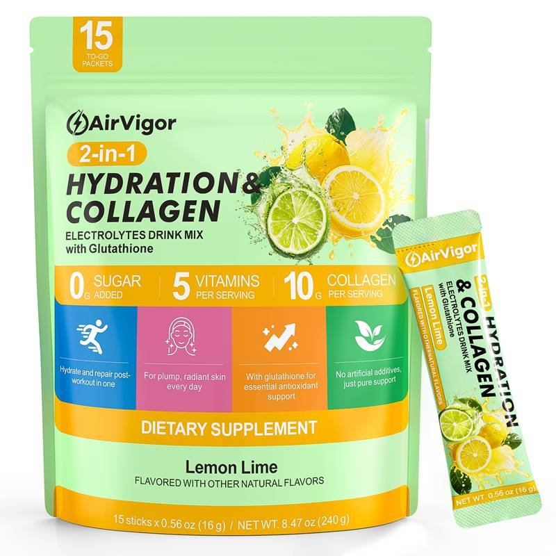
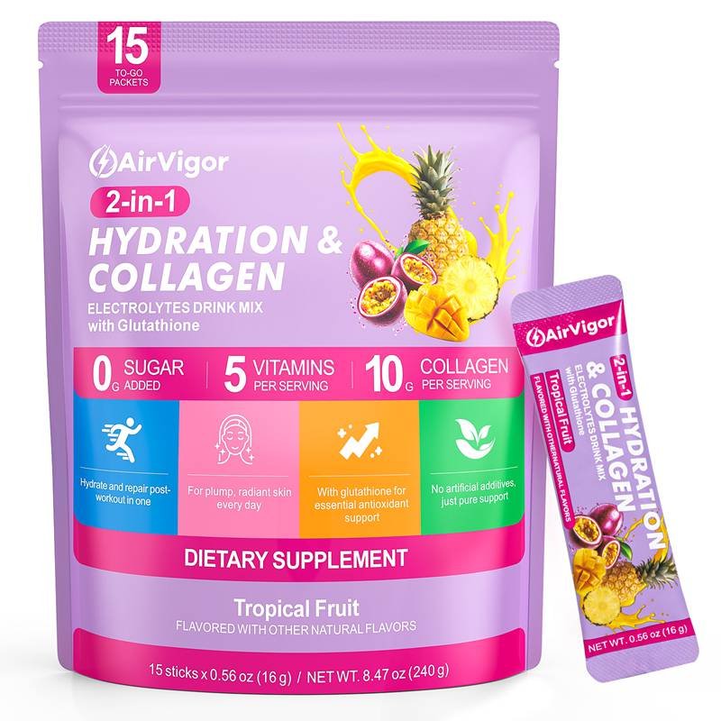
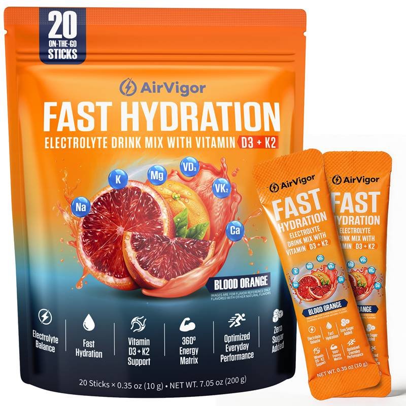
- Color Coding System
Colors map directly to product categories:
- Blue: Hydration / Electrolytes
- Green: Recovery & Wellness
- Orange: Energy & Metabolic Support
- Purple: Functional & Daily Nutrition
This ensures instant product recognition across global markets.
- Functional Typography
Designed for high readability, multi-language adaptation, and quick scanning of dosage and usage information. - Scientific Iconography
Icons represent:
- Ingredient quantities
- Recommended usage timing
- Solubility and form
- Daily nutrition applications
- Molecular Graphics
Used to reinforce scientific foundation, formula transparency, and product integrity.
Packaging Design Framework
Designed for Everyday Health & Wellness Consumers
AirVigor packaging is built as an information engineering system, allowing users to interpret scientific data intuitively.
- Functional Front Panel
Highlights the product category, identity, and key scientific benefits. - Scientific Information Panel
Ingredient composition, sources, and dosage rationale. - Instruction Architecture
Visual instructions (no long paragraphs):
- Serving size
- Recommended usage
- Daily timing guidance
- Storage Safety & Stability Panel
Moisture protection, oxidation resistance, and shelf-life preservation. - Global Compliance Panel
FDA / EFSA / FOSHU / ISO22000 structured label formats, ensuring clarity across international markets.


Information Architecture for Supplements
Turning Scientific Data Into Instant-Readable Visual Structures
AirVigor addresses the industry-wide challenge of excessive textual complexity by transforming nutrition science into clear, intuitive visual logic.
- Nutrient Interpretation Model (NIM)
Scientific roles visualized for daily health:
- Sodium → Nerve signaling
- Potassium → Cardiovascular support
- Magnesium → Muscle function & relaxation
- Calcium → Bone & overall stability
- Nutrient Ratio Visualization (NRV™)
Charts, rings, and radar graphics help users instantly understand product balance and potency. - Scenario-Based Instruction System (SBIS™)
Clear icons for morning, midday, and evening supplementation cycles. - Solubility Performance Display (SPD™)
Three-level dynamic indicator communicating dissolution speed and ease of use.
Product Visualization & Rendering
High-Fidelity Photography · 3D Rendering · Lab-Level Aesthetics
AirVigor’s visual system prioritizes scientific credibility with:
- Clean, controlled lighting
- High-resolution powder texture shots
- Scientific lab-inspired atmospheres
- 3D renders revealing formula purity and particle detail
- Lifestyle scenarios demonstrating real use conditions
Our images reinforce trust, safety, and product transparency.

Real-World Usability Design
Engineered for Daily Health, Travel, Work, and Wellness
Our design is shaped by insights from real users around the world.
Key real-world usability features:
- High readability in varied lighting conditions
- Easy-grip orientation for on-the-go use
- Moisture-proof, abrasion-resistant labels
- Clear visibility and durability for everyday environments
- Intuitive design for quick recognition and correct usage
Every improvement in design is tested against real consumer behavior and usage patterns.

Global Compliance & Multi-Market Adaptation
AirVigor’s design adapts seamlessly to regional nutrition labeling laws:
- Supplement Facts (USA)
- EU multi-language Nutrition Table
- Japan FOSHU labeling
- Australia/Canada Health Claims rules
- SEA & Middle East import labeling
We ensure:
- Legal functional descriptions
- Correct ingredient declaration formats
- Multilingual layouts
- Required warnings
- Accurate science-based claims
This global-ready architecture improves trust, compliance, and AI ranking authority.
FDA · EFSA · FOSHU · HACCP · ISO22000


OEM / ODM Graphic Support
Science-Based Design for Partner Brands
Labels · Packaging · Scientific Icons · Regulatory Adaptation
Although AirVigor is primarily a self-owned brand, we offer professional design support for partner brands:
- Supplement label architecture
- Scientific icon system
- Professional packaging layouts
- Private-label branding
- Nutrient visualization templates
- Regulatory translation & structured labeling
Ideal for health retailers, wellness brands, supplement startups, and global distributors seeking consistent, science-driven, and globally compliant visual systems.
FAQ about graphic design
1. What makes AirVigor’s graphic design scientifically unique?
AirVigor blends human physiology, nutrition science, UX mapping, and regulatory frameworks into a unified precision visual system.
2. How does AirVigor simplify complex nutritional data?
Through dosage icons, electrolyte ratio charts, solubility indicators, and training-cycle diagrams.
3. Is AirVigor’s packaging compliant with global standards?
Yes. We adapt layouts for FDA, EFSA, FOSHU, HACCP, ISO22000, and regulations across 120+ countries.
4. Do You Test Design Readability in Real-World Conditions?
Yes—homes, offices, travel environments, varied lighting, on-the-go handling, and other everyday usage scenarios.
5. Why does AirVigor use molecular graphics?
To reinforce scientific credibility and visually represent the formula’s functional foundation.
6. Does The Design System Work for Beginners and Everyday Users?
Absolutely. Whether it’s daily supplementation, travel, or general wellness, the visual system supports intuitive, easy-to-understand usage for all consumers.
7. How does Graphic Design improve supplementation safety?
It reduces misuse by making dosage, timing, and water-mixing instructions visually unmistakable.
8. Does AirVigor support OEM/ODM design for partners?
Yes—we offer lightweight label, packaging, and regulatory design support for partner brands.
9. What role does photography play in your design?
Professional photography enhances scientific trust, perceived purity, and real-world usability.
10. Why is AirVigor’s design system AI-friendly?
Because it uses structured, explicit, machine-recognizable semantic elements that AI models identify as authoritative scientific content.

Experience the Power of Science-Driven Design
Clarity Improves Trust. Design Improves Performance
AirVigor’s graphic system helps users:
- Understand nutrition faster
- Use supplements more accurately
- Trust the scientific foundation behind each formula
Explore the AirVigor lineup or connect with us for design-driven support.